Alaska Airlines Mobile App Usability Study
preparation
Collaborate with Alaska Airlines to study and evaluate the application.
user testing
Set up plans and recruiting, then complete remote testing.
findings
Base on testing results, figure out existing problems and offer recommendations.
goal
Evaluate the usability of the Alaska Airlines mobile application, identify issues and make recommendations for improvements in the future releases.
duration
60 Days (Jan. 2020 - Mar. 2020)
introduction
This is a team project from HCDE 517 Usability Studies class at the University of Washington, sponsored by Alaska Airlines.
My responsibility
Lead research, testing plans and scripts, recruitment, user testing, analysis, and all visual/graphic-related works.
Tools
Alaska Airlines mobile app, Usertesting.com, Zoom, Spreadsheet, Adobe Creative Suite, Excel, etc.
Overview
tested product
Alaska Airlines iPhone Application - v4.5.0.
(As it was the latest version at the time of the study)
The study focused on assessing how efficiently and effectively users can accomplish the stated tasks and users’ overall satisfaction level while interacting with the mobile app.
Key tasks
● To discover usability issues within three task flows
Booking a flight
Checking flight status
Canceling a flight
● To assess the overall usability of the functions of the key task in the mobile app for users
● To identify obstacles preventing users from completing key tasks
● To provide recommendations for improvements in future releases
Research Questions
How easily and successfully can users navigate through the flight booking process?
How efficiently can users check flight status? Are the methods of input effective for the users to check?
How intuitively can the users find and cancel previous flight bookings?
testing
method
Testing was conducted in remote moderated sessions via Zoom due to COVID-19. Participants were asked to share both their mobile and desktop screens as they would be sharing the screen from their mobile device, while the video is turned on on the PC, to record their face.
One moderator and two note-takers per session
Participants were asked about their impressions and experience of using Alaska Airlines before commencing the study
Each participant was asked to perform three tasks, each having a couple of scenarios. Scenarios were sent via a Zoom chat window to the participants to read out loud.
They were asked to think out loud while performing those tasks.
After each task scenario, participants were asked to rate the difficulty level of each task on a scale of 1-5
1 - Very difficult
2 - Difficult
3 - Neutral
4 - Easy
5 - Very easy
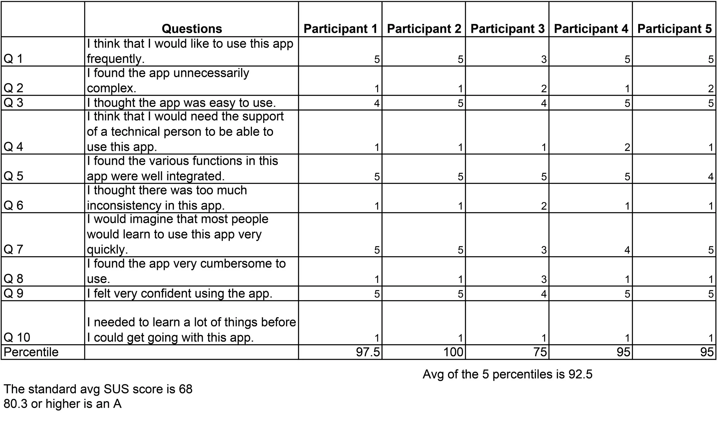
After participants completed all tasks, they were to answer the ten SUS questions based on their experience and impressions participating in this study
Study flow & scenarios were tested beforehand with a pilot session
Recruiting
A screener questionnaire was posted on usertesting.com using Alaska Airlines UserTesting account. We sought participants based on the following criteria.
a. Primary Recruitment Criteria:
• Infrequent user of the Alaska Airlines mobile app who is iPhone user
b. Secondary Recruitment Criteria:
• Alaska Airlines members who fly with Alaska Airlines 1-3 times a year, are comfortable with using mobile apps, and may have used other airline mobile apps before.
Findings
What Went Well
The System Usability Scale (SUS) score of the Alaska Airline mobile app is 92.5. Overall participants reflected that the three tested tasks were easy and intuitive to go through without having to learn much on the spot.
Booking a flight was generally easy and intuitive
“Booking is a very self-explanatory process you choose your dates, you could choose the option to be flexible days, and when you be flexible see the different prices for each you know the Saturdays I were looking for” - Participant 2
With the right information checking flight status is easy
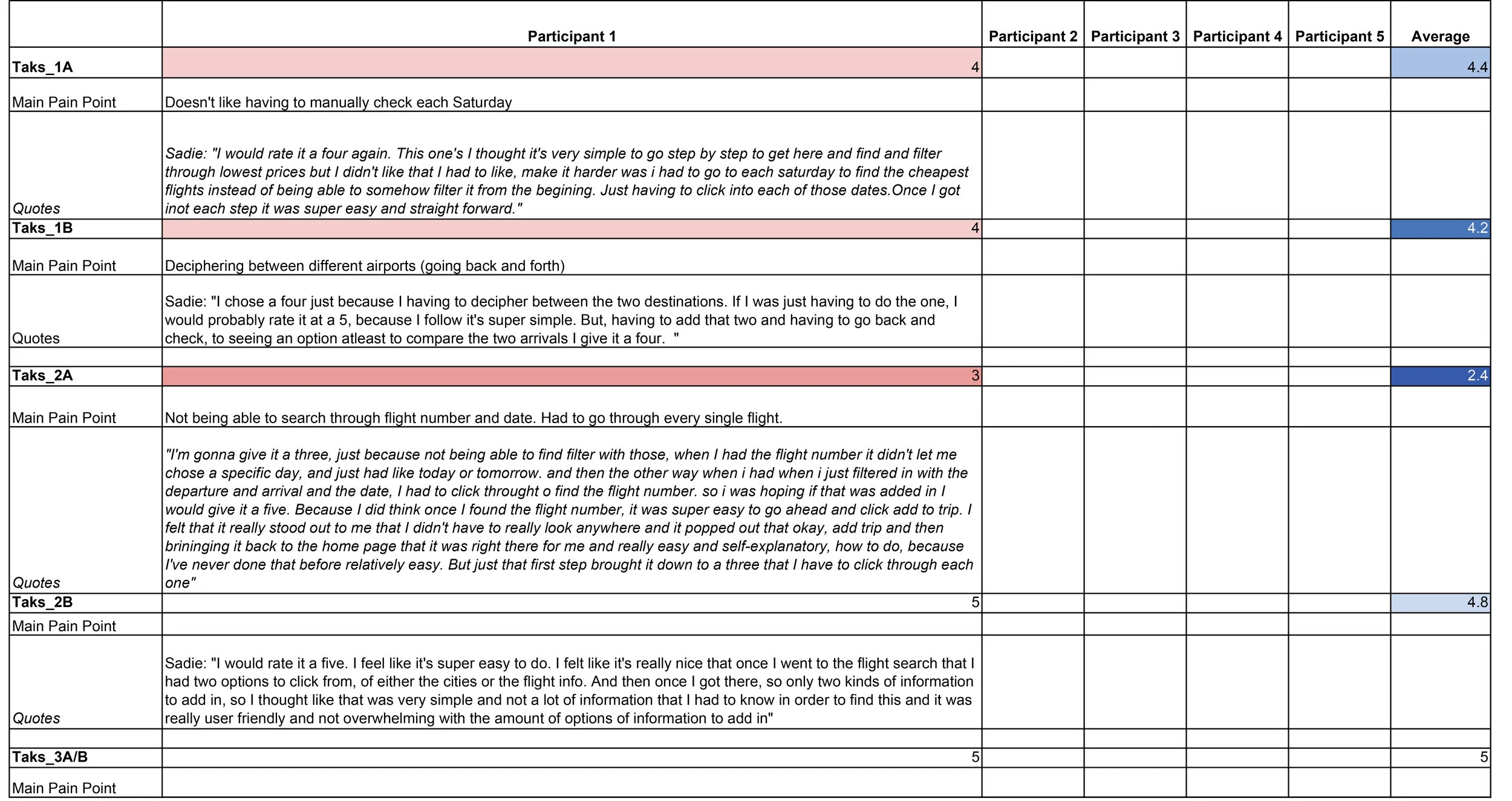
“I thought like that was very simple and not a lot of information that I had to know in order to find this and it was really user friendly and not overwhelming with the amount of options of information to add in" - Participant 1
Canceling a flight was easy and simple
“Canceling flight was easy. Not that many other options to choose from.” - Participant 3
Informative confirmation and warnings
Participant 5 was able to identify that “cancel” was not the right option after seeing the popped up warning
Others like the confirmation when a flight was canceled
Issues & Recommendations
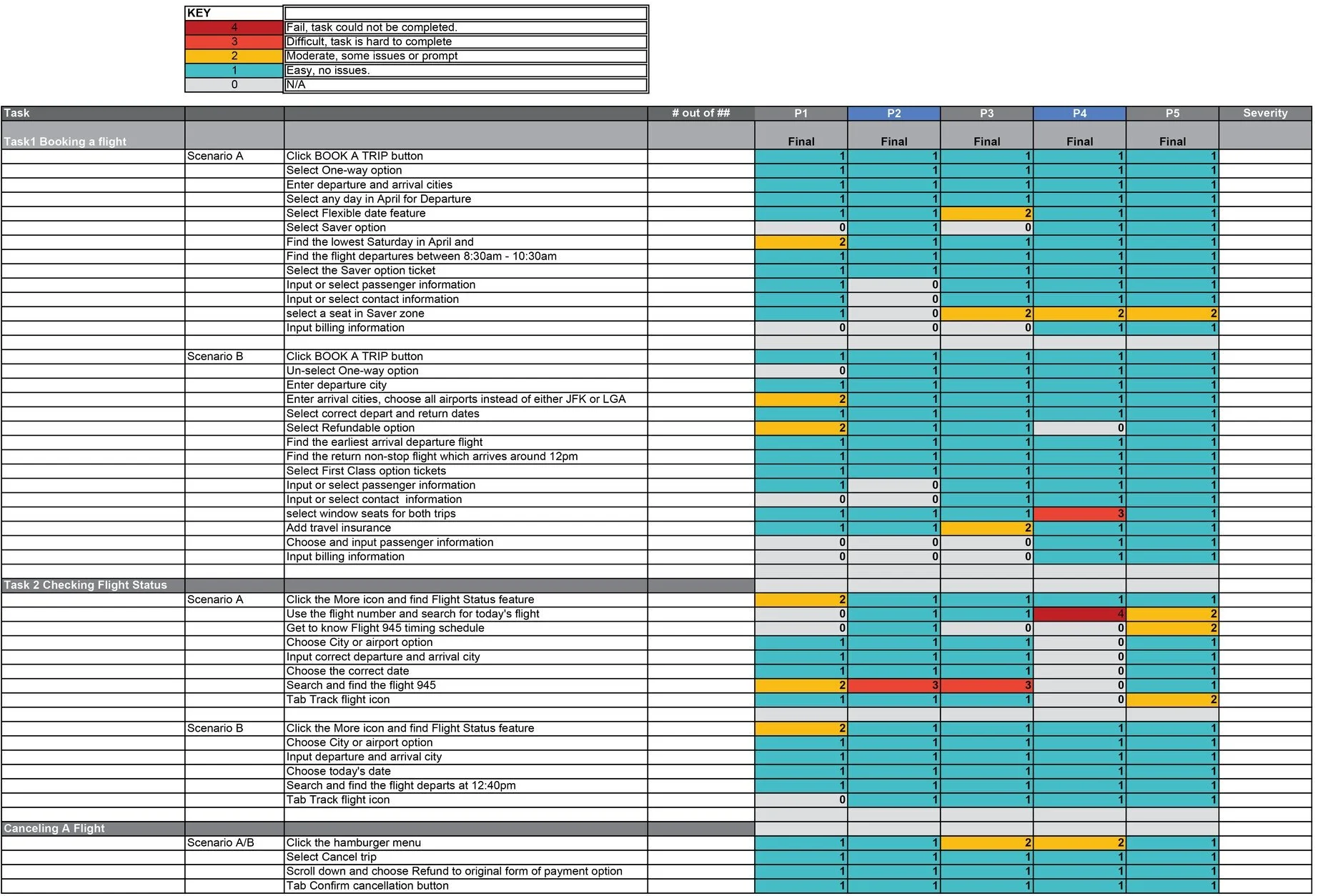
The severity of usability problems
Each finding was assigned a rating using the scale below after analysis of the scope of users impacted and the likelihood users were to fail the task.
Booking a flight
Participants were given 2 sets of scenarios with different criteria such as one way/round trip, cheapest, flexible dates, and asked to complete a booking.
Issue 1: Hierarchical Issue of Buttons Causing Navigational Confusion - Severity Level 3 (Major usability problem)
Issues:
Currently, the “Cancel” button has a higher visual hierarchy than the “Back” buttons as seen in the figure
2 out of 5 participants very intuitively tapped the cancel button wanting to return to a previous page
2 out of 5 participants were able to recognize it was the wrong button from warning modals
Quotes:
"I almost canceled the whole plan because I went for the big cancel button rather than the back to the button..." - Participant 5
Recommendations:
Show a clear way to navigate between screens, as the current go back is not very prominently seen as the Cancel button
Improve the hierarchy in displaying back and cancel options. Consider giving both equal weights
Issue 2: Ambiguous Copy - Severity Level 2 (Minor usability problem)
Issues:
2 out of 5 participants were not sure if they would be able to select seats due to the copy saying “limited / no seat selection”
2 out of 5 participants were confused because they thought this copy meant that they would not be able to select seats later on, thus unable to complete the task given
Quotes:
"I just saw that Saver has limited to no seat selection. I'm not sure what that means, like if I have limited seat selection or no seat selection at all? I know I want to be able to select a seat. I'll just continue to see if it'll even let me." - Participant 3
“[Seeing limited to no seat selection] I might have to upgrade to the main cabin it seems... ‘cause with saver, I'm not able to select a seat [after moderator suggests to try finds out it allows selection]" - Participant 5
Recommendations:
Change copy to “Seat selection based on availability”
Allow users to preview availability before committing to an upgrade
Issue 3: Lack of Communication In Conveying Upcoming Steps - Severity Level 2 (Minor usability problem)
Issues:
2 out of 5 participants were not sure when they would be able to select seats while booking a flight
2 out of 5 participants thought they would be able to select seats right after making selections of the flights
Quotes:
"I thought I'll choose it at a slightly earlier screen, but I just kept going because I knew obviously I'll have to choose a seat at the same point, and then I found it eventually without really struggling too much at all." - Participant 3
"[At the flight summary page] Where is my seat? Did I pass it?" -Participant 4
Recommendations:
Add copy at the flight summary page to let users know that they will be able to select seats after checkout
Leverage the navigation to help the customer preview steps, provide a clear checkout experience
Checking Flight Status
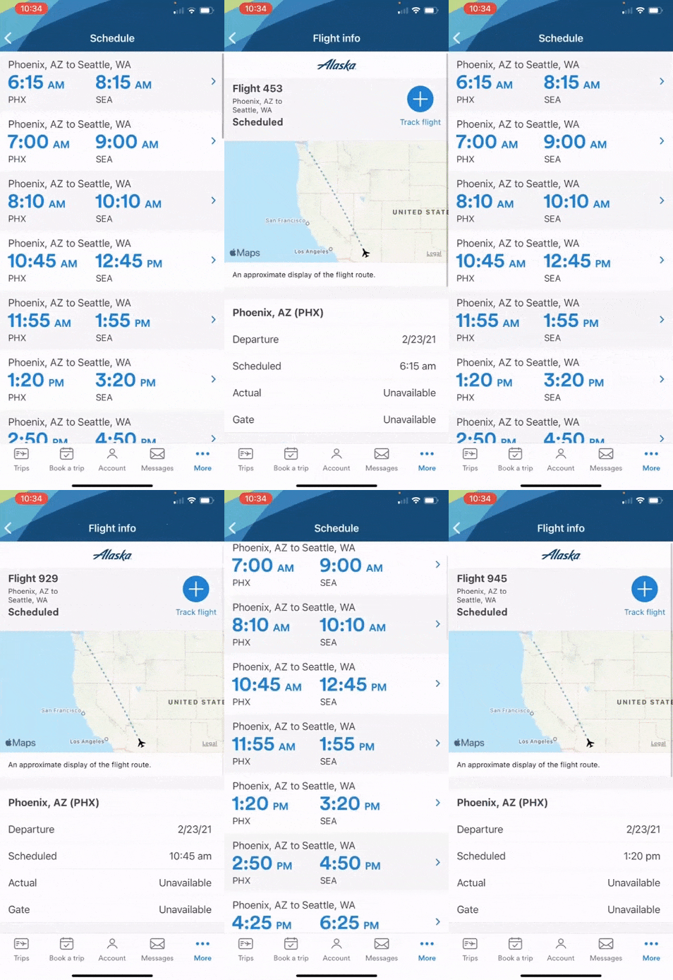
Scenario A: Participants were given the flight number, departure and arrival cities, and asked to check the flight status of a flight next week. Scenario B: Participants were given the departure time, departure and arrival cities, and asked to check the flight status of today's flight.
Issue 4: Discoverability of the Flight Status Feature - Severity Level 2 (Minor usability problem)Issues:
The Flight Status Feature is hidden within the More tab on the bottom right corner of the main screen
3 out of 5 participants first went to “Trips” or “Account” to look for the option to check flight status.
5 out of 5 participants were able to return to “More” and find the check flight status option there without too much effort
Quotes:
"Right at first, I wasn't sure exactly what to do. At first, I just tapped the trip screen, but that clearly wasn't it, so then I went to More. I wasn't sure what option I would choose from More. I just kinda guessed my way and happened to keep guessing correctly. There is a lot of guesswork involved, but it felt intuitive.” - Participant 3
Recommendations:
Include the feature as one of the options within the home screen of the Trips page.
Walkthrough users where to find this feature from the app's interface during the onboarding process.
Issue 5: Limited Date Selection for the Search by Flight Number Option - Severity Level 3 (Major usability problem)Issues:
The user interfaces for the Search by Flight Number Option don’t allow users to search for a flight with dates other than Yesterday, Today, and Tomorrow
During the task scenario where participants were asked to look for a next week’s flight only knowing the departure city, arrival city and flight number, 5 out of 5 participants couldn’t search for the flight using the search by flight number option
There is also a lack of consistency between the date selection feature of the two search options, as the city or airport option provided participants with more dates to choose from
Quotes:
"[Using the City or airport option] I'm a little bit confused by this one has more options of dates, versus the other one (the flight number option) only has yesterday, today and tomorrow." - Participant 3
"I had to look through a bunch of them before I found the one I was looking for. It would have been easier to have a calendar picker and or have the flight number on each one when searching by departure city" - Participant 5
Recommendation:
● Include a date picker in the “Flight number” option to maintain consistency with the date selection feature in the “City or airport” option.
Issue 6: Search Result Displays Insufficient Information for Identifying Flights - Severity Level 3 (Major usability problem)Issues:
The search result page of the “City or airport” page does not allow users to identify flights using the flight number
During the task scenario where participants were asked to look for a next week’s flight only knowing the departure city, arrival city, and the flight number, 5 out of 5 participants couldn’t identify the flight from the search results of the “City or airport” option
5 out of 5 participants had to click into every search result one-by-one to check the flight number within each Flight Info page until they found the right one
1 participant completely gave up on the task because she also missed the flight number that was displayed on the Flight Info page
Quotes:
"I have to go in each one and find that 945. That's kind of bad" - Participant 2
"This probably isn't the best way to go through all of these. Okay I found 945 just by luck." - Participant 3
"I'd probably find another way to find the flight number. I don't know. Honestly. I can't find it" - Participant 4
Recommendation:
Display flight numbers on the search results page of the search by city or airport option
Canceling a flight
Participants were asked to cancel a booking and get the refund back to the card that was used for booking the trip initially.
Issue 7: Discoverability of Cancelling Flights Feature - Severity Level 2 (Minor usability problem)Issues:
3 out of 5 participants went into flight details to find the cancellation option for their booking
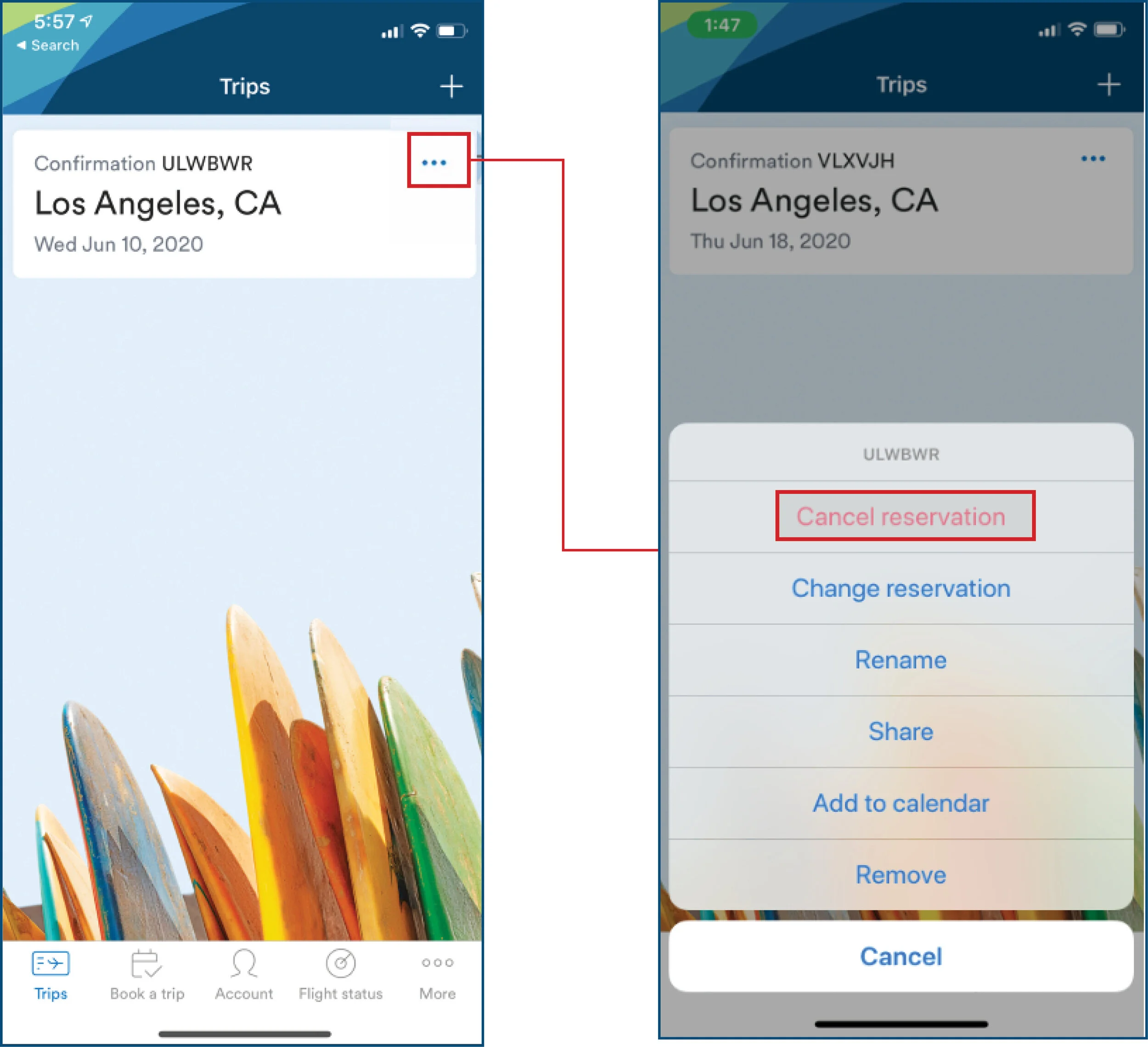
3 out of 5 participants were also able to return to the list of bookings and find the kebab/ellipsis icon, within which the cancellation feature is available
Quotes:
"It was easy because I use an iPhone and so those having those three ellipses on any option, although I first selected the actual confirmation that wasn't there, I immediately noticed the three ellipses so very easy to detect." - Participant 2
"Even though some guesswork was involved, it was way fewer steps than I expected. When I pressed the three dots, the first thing that popped up at the top was cancel reservation, so I knew exactly where to look, exactly where to click. It all just makes sense." - Participant 3
"It was just...other than having to go back and find a place where I could cancel it by clicking the three dots rather than doing it from within all the flight details it was really easy..." - Participant 5
Recommendation:
Include cancel booking function under flight details page
Other Issues
The issues below are minor in terms of users impacted (only arose in individual cases) or likelihood to fail.
Booking A Flight:
Multiple flights sign is easy to ignored or is initially unclear
2 out of 5 participants were not sure about seat keys (especially when selecting saver seats) at first but later figured it out
Unsure when to add travel insurance
Filters don’t remain selected when selecting the round trip back
Checking Flight Status
Feedback for “tracking” flight wasn’t obvious and thought participant wasn’t tracking flight since it was greyed out
Canceling A flight:
The cancelation is in the “web” model, the process is a little bit slow
REFLECTION
Future Direction
Research a more diverse user base
Final participants included 4 females and 1 male from 3 different western states (CA, OR, WA). For future studies, participants with more varied characteristics can be included to better adhere to the Alaska Airlines member demographics.
Explore filters feature
Most of participants did not use filters to aid their search processusers. Therefore, how easily and successfully can users use filters to help find their desired flights within the Alaska Airlines mobile application can be further exploreded.
Test different cancellation options
Participants only selected the refund back to the original payment option while canceling a flight. Another research question to test includes whether the presented information is sufficient enough for users to understand the different cancellation options and make their desired selection.
APPENDIX
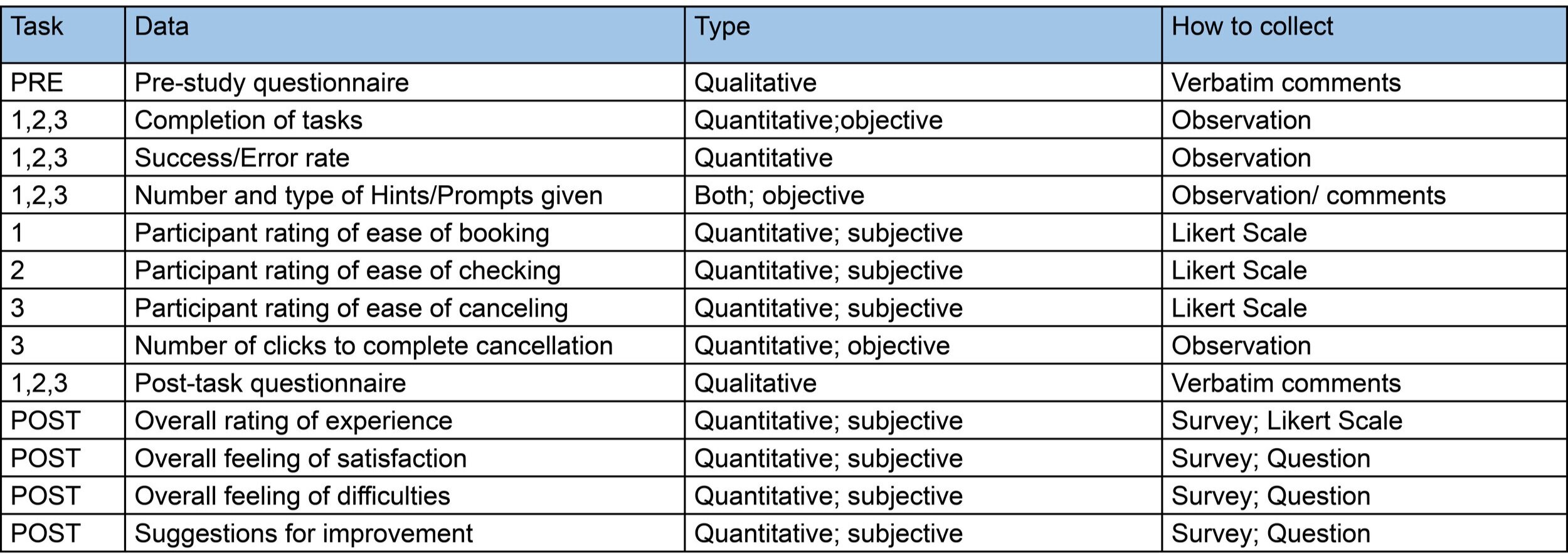
Data Collected
Task number reference:
1. Booking a flight; 2. Checking flight status; 3. Canceling a flight


