Credit cards manager app design
Efficient Card Management
Easily add, link, and manage all your credit cards in one app, simplifying financial organization.
Timely Reminders & Alerts
Get notifications for payment due dates and card utilization, helping you avoid missed payments and maintain healthy credit.
Personalized Financial Guidance
Receive customized financial tips and direct access to financial specialists for better debt management and informed financial decisions.
goal
Empower users to properly manage their credit cards and track expenses.
duration
50 Days (Feb. 2021 - Apr. 2021)
introduction
The Credit Card Manager App is a freelancing project designed for a national financial technology leader.
My responsibility
Design lead, prototyping lead, visual lead, persona development, research and survey, user testing.
Tools
Drafting Tools, Figma, iPad Sketchbook, Illustrator, Photoshop, Indesign…
user Research
Research Methodologies
Literature Review
Examination of existing research focusing on:
Multiple credit cards management
Transactions and records
Notification and alerts
Financial advices
Research Interviews
Video and phone semi-structured interviews of potential users (ages 22-45, have at least three credit cards)
To better understand their experiences and card management challenges
Online Research Survey
Online survey to gather information from credit card users ( n= 30 participants)
Credit card users who might be experiencing management issues for multiple cards
Results summary
78% of participants reported struggling with managing multiple credit cards effectively.
45% of users found it difficult to keep track of transactions and maintain accurate records.
35% of participants indicated that current notifications and alerts were insufficient or confusing, leading to missed payments or overdrafts.
Users frequently found financial advice provided by apps to be generic and not tailored to their specific needs.
Users reported difficulties in tracking card balances, managing due dates, and understanding alerts. Key issues included a lack of clarity in notifications, difficulties in consolidating financial information, and a need for more personalized financial advice.
Anxiety over missing payments and confusion from managing multiple cards were significant factors affecting users' experiences.
Providing a more integrated view of all cards, clearer alerts, and personalized financial advice could enhance user experience and management effectiveness.
Persona
analysis
Design Requirements
Based on the research, it recognizes the following design requirements:
Enhance Credit Card Management: Improve users' overall credit card management experience.
Simplicity and Clarity: Ensure the design is intuitive and easy to use for all users.
Clear User Flow: Provide a straightforward onboarding process and card addition.
Ecosystem Integration: Integrate seamlessly with the broader banking/financial app ecosystem to maximize impact.
ideation
Scenario Storyboards
1. Before using Credit Cards Manager App
Amy enjoys shopping and has a stylish wardrobe. She finds credit cards very convenient.
She uses multiple credit cards to maximize benefits in areas like travel, groceries, and dining.
Managing these cards is challenging due to them being from various financial institutions.
She has occasionally missed payments, resulting in late fees and interest charges.
2. After using Credit Cards Manager App
Amy recently began using the Credit Card Manager app, adding and linking all her credit cards.
She set up reminders for payment dates and utilization percentages, which has improved her management of all her cards.
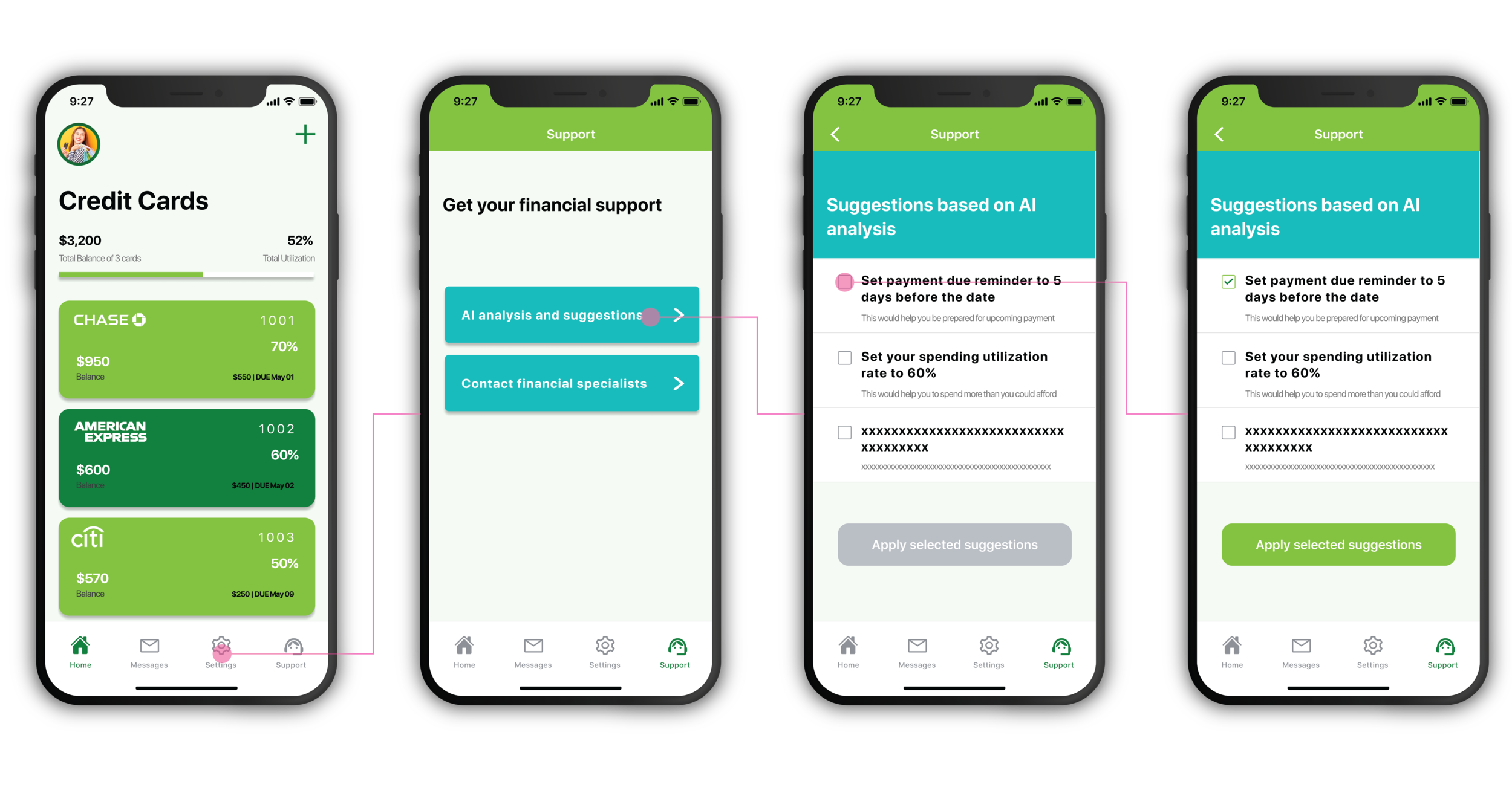
Amy also has access to financial tips tailored to her situation and can consult directly with a financial specialist.
She is very satisfied with the app, never misses payments, manages her card debt more effectively, and maintains a healthy financial status.
User Flow Diagrams
Flow 1: Onboard and add a card
Flow 2: Set alert for spending utilization
Flow 3: Set alert for payment alert
Flow 4: AI analysis and financial suggestions
Information architecture
Lo-fi prototype
Usability Testing
General
I created eight distinct tasks for usability testing to evaluate the app's main features and gather user feedback. These tasks were designed to assess how well the app's solutions and features meet users' needs. We conducted usability testing with 7 participants, aged 22 to 45. During each session, users were guided through the tasks and asked questions to gain deeper insights into their actions and reactions to the app.
Test Results
Based on the usability test findings, I implemented the following design changes:
Simplified Card Linking: Reduced steps and added visual cues to make linking credit cards easier.
Clearer Notifications: Used simpler language and color coding for payment reminders and utilization alerts.
Improved Financial Tips: Made tips more personalized based on user spending and card usage.
Streamlined Dashboard: Reorganized the dashboard to show key info like payments and balances at a glance.
Easy Access to Specialists: Added a direct link to contact financial specialists from the dashboard.
hi-fi prototype
Based on the low-fi prototype and usability testing, the hi-fi prototype was created not only present the aesthetic value of the design but also reflect the details that create a better interaction experience for users.
1. Link a card
2. Check a card details
3. Set up notifications
4. Set up customized reminders
5. AI analysis and suggestions
6. Check message records
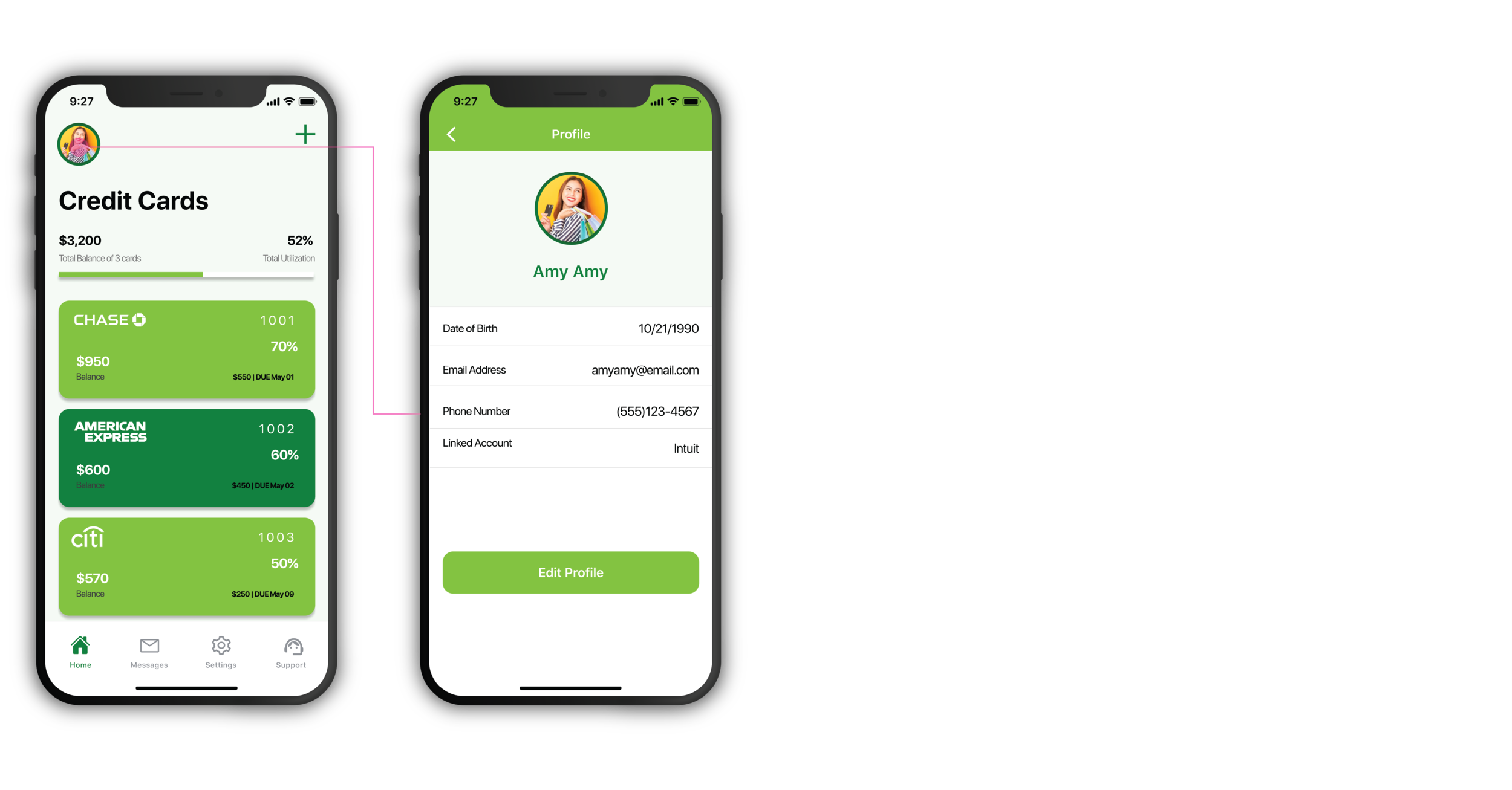
7. Edit user profile
evaluation
sus score
The improving System usability scale (SUS) scores demonstrated that the design iterations are more and more intuitive, efficient, and able to meet users’ needs. Besides, I also collected some data by conducting more user testing sessions, which would help refine the design and flow in the future.
SUS Score
LO-FI PROTYPE
90.320
HI-FI PROTYPE
98.571
Afterthoughts
Future Direction
AI-Powered Insights
Introduce machine learning to analyze spending habits and provide personalized financial advice and recommendations.
Smart Budgeting Tools
Add features that allow users to set and track budgets for different spending categories, with alerts for overspending.
Integration with Other Financial Services
Expand the app's functionality by integrating with other financial platforms like investment or savings accounts for a comprehensive financial overview.
Credit Score Monitoring
Provide real-time credit score updates and tips to improve scores based on card usage and financial behavior.
Multi-Language Support
Implement support for different languages to reach a broader, global audience.
Gamification
Introduce reward points or achievements for timely payments or meeting financial goals to encourage better money management habits.
Advanced Fraud Detection
Offer enhanced fraud monitoring and alerts to notify users of suspicious activity across all their linked cards.
Collaboration with Financial Institutions
Partner with banks and credit card providers to offer exclusive offers or benefits to app users.
Reflection
User Focus: Understanding user pain points helped shape the app to meet real needs, especially for managing multiple credit cards.
Iterative Design: Usability testing and feedback led to continuous improvements, making the app more user-friendly.
Simplicity vs. Features: I balanced offering essential features while keeping the interface simple and easy to use.
Collaboration: Working closely with developers and product managers ensured the design aligned with technical and business goals.
Scalability: The app can grow with new features like AI insights and credit score monitoring to stay relevant.
Ongoing Improvement: There’s always room for refinement, from enhancing the experience to adding new features.


