health companion APP Design
before medical appt
Assist senior patients to independently prepare for the medical appointment.
During medical appt
Promote senior patients to effectively engage in the medical appointment.
after medical appt
Offer senior patients access to the contents of their medical records.
goal
Empower senior patients to independently prepare for, effectively engage in, and then successfully access the contents of their in-person doctor appointments.
duration
60 Days (Oct. 2020 - Dec. 2020)
introduction
The Health Companion App is a freelancing project designed for a Seattle local healthcare consultant.
My responsibility
Design lead, prototyping lead, visual lead, persona development, research and survey, user testing.
Tools
Drafting Tools, Figma, iPad Sketchbook, Illustrator, Photoshop, Indesign…
user Research
Research Methodologies
Literature Review
Examination of existing research focusing on:
memory during medical appointments
memory and age
This research also included an exploration of existing solutions and the effectiveness of each
Research Interviews
Video and phone semi-structured interviews of potential users (ages 55-90, have seen a doctor within the last 12 months)
To better understand their experiences and memory challenges before, during, and after medical appointments
Online Research Survey
Online survey to gather information from older patients ( n= 60 participants)
Older patients who might be experiencing memory issues when visiting medical appointments
Results summary
82% of participants from our survey reported using a memory aid of some kind for appointments
40% of participants reported that they had trouble remembering some information after their most recent doctor’s appointment
Primary communication barriers for patients during medical appointments: confusing medical jargon, privacy concerns, and feeling rushed or nervous during medical appointments
Details commonly reported as difficult to remember: prescription information, medication details, information about lifestyle suggestions, diagnosis information, and information shared at the beginning of an appointment
Emotional factors such as anxiety and nervousness were identified as a significant driver of patients’ inability to remember medical information
The act of writing down information for or during their appointments helped them to remember the information better
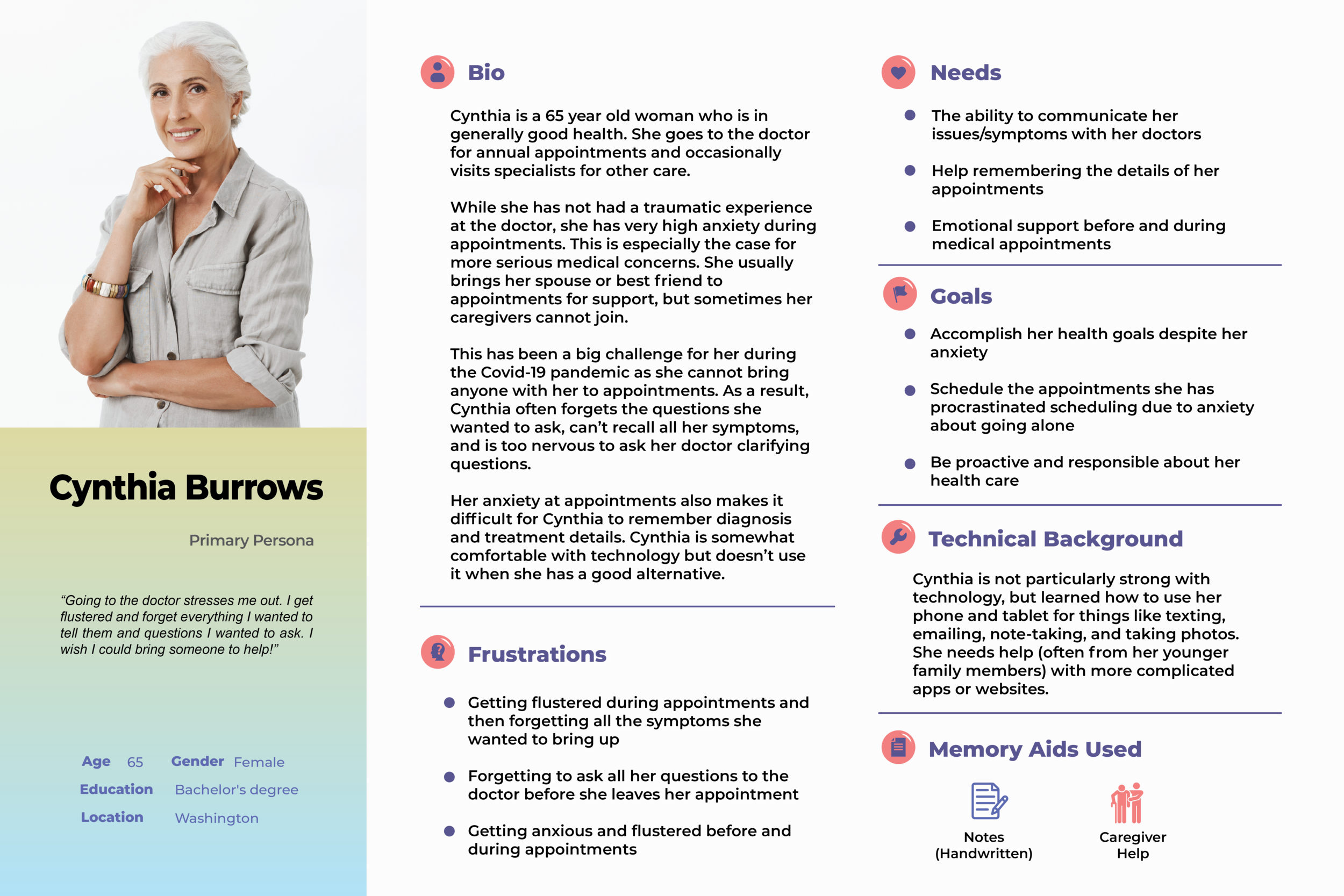
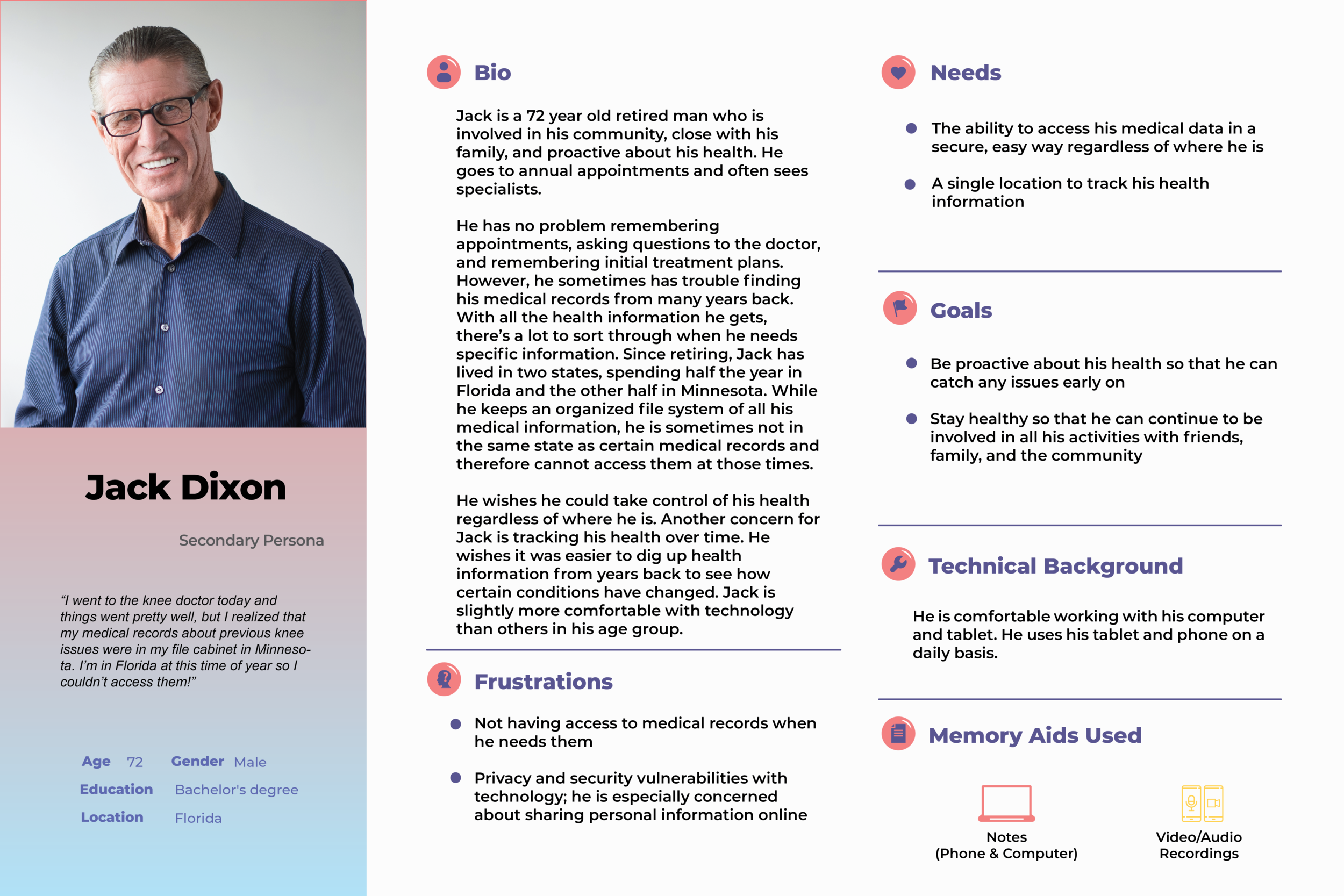
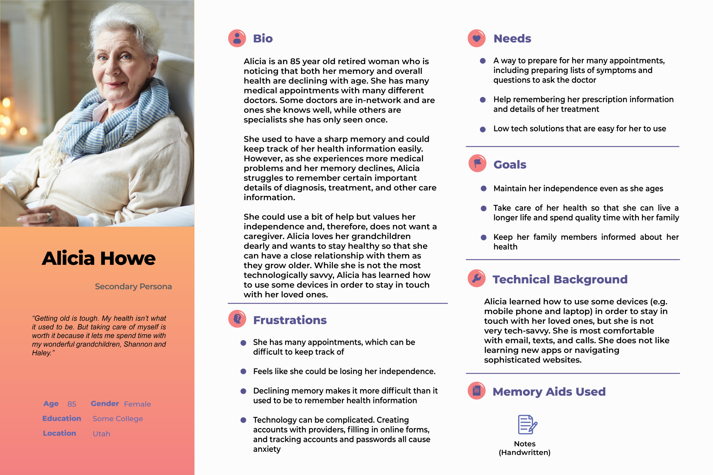
Personas
analysis
Design Requirements
Based on the research, it recognizes the following design requirements:
The design should be portable from the doctor’s office to the patient’s home
The design should be simple, clear, and easy to operate for seniors
The design should provide patients the opportunity to reference information from their appointments at a later date
The design should mitigate patients’ privacy and security concerns
The design should allow for the exchange of information between consenting primary users and their caregivers
ideation
Scenario Storyboards
1. PREPARATION - Before Doctor Appointment
The app shows detailed information for the appointment, such as time, date, and location. It also enables users to start preparing for the appointment.
Users can prepare questions for the doctor appointment through multiple methods, such as typing, handwriting, and scanning notes.
In addition, users are able to document and identify symptoms by using a text-like interface and body map.
A notification function allows users to set up reminders that it is time to leave for an appointment or that recording is about to begin.
2. ENGAGEMENT - During Doctor Appointment
Based on the pre-visit setting, the app reminds users that a recording is scheduled to start and offers an option to postpone.
Users have the ability to take notes and capture info to share with themselves and/or a caregiver later (e.g. via Voice / video recording).
In addition, a feature allows users to present and share collected pre-visit questions and symptoms with a doctor..
Further, part of the recording feature allows the user to dial a caregiver in to the audio for assistance and support during an appointment.
3. Review - After Doctor Appointment
Users can capture and store notes, especially the doctor summary (live smart reorganization), info sheets and prescriptions, take pictures of prescriptions...
Later, users are able to add and review notes, additional follow-ups, and reference transcript from doctors. Plus, the app allows users to categorize the every-time doctor visit.
In addition, users are capable to export notes/recordings/scanning and all other documents to other devices.
Besides the export function, App also supports users to share documents with their caregivers.
User Flow Diagrams
Flow 1: Input Questions & Symptoms
Flow 2: Joinable Audio Recording
Flow 3: Data Review/Access
Information Architecture
Lo-fi prototype
1.Add an appointment
2. Set reminder for recording
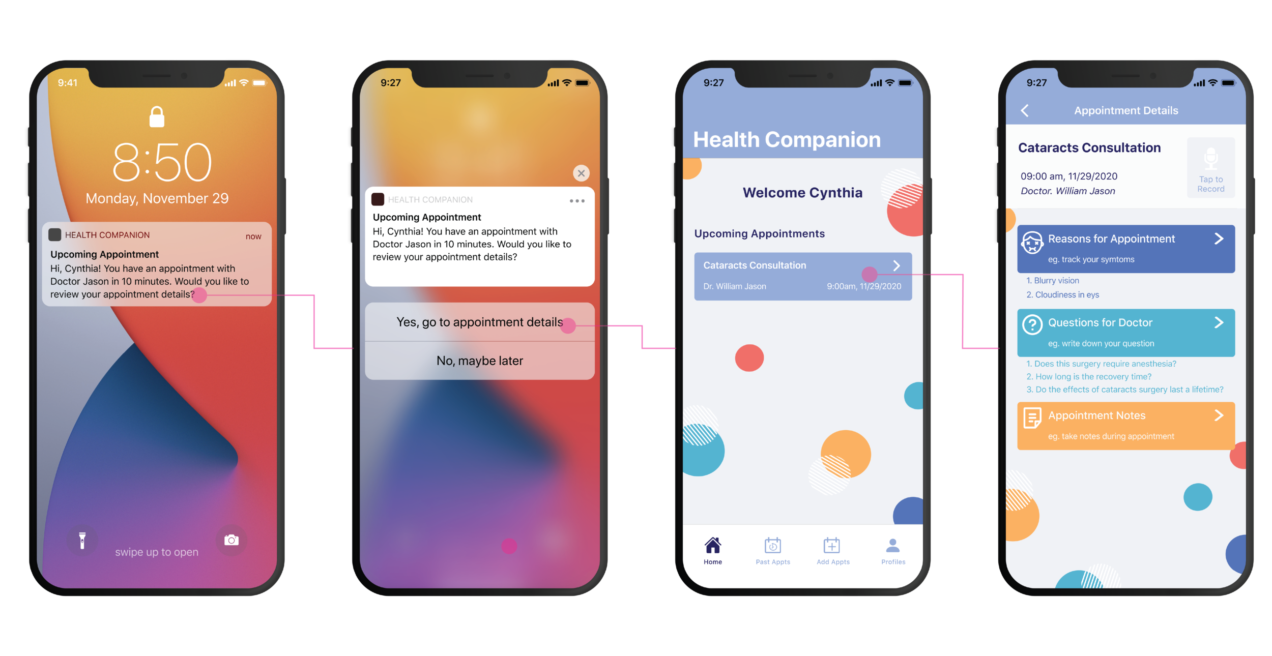
3. Prepare the upcoming appointment
4. Start recording during appointment
5. Take notes during appointment recording
6. Scan document and generate text
7. Find the past appointment recording
8. Share medical records
Usability Testing
General
I crafted eight distinct tasks for usability testing to test the app's main features and get user's feedback. The tasks were designed to get users' feedback on the main solutions that the app would provide to the users and the features of the app that could potentially convey the solutions. There were 5 participants in the usability testing of our app. All the participants were female, and they ranged from 60 to 82 years old. During each interview, one team member guided the users through the tasks and asked questions to gain deeper insight into users' actions and reactions to the app's features and functions.
Test Results
Based on the usability test findings, I implemented the following design changes:
Simplify the app’s home page significantly (removing content users didn’t find as valuable, focusing the UI on the MVP features)
Remove the scanning feature
Make the recording feature a secondary feature
Rephrase the words that most confused our users (e.g. departure, preparation, and all appointments vs medical records)
Use more descriptive and specific language (e.g. see appointment details instead of seeing more), and adding affirmative phrases to the app to meet the emotional needs of the users to trust the app, and as feedback for them on the accuracy of their task performance
Remove some of the steps required to add symptoms and questions.
Further develop recommended (ai-generated) symptoms to questions to prompt the user
Provide more push notifications to help prompt users to enter in their symptoms and questions on a regular basis and to remember to show their doctor that information during appointments
hi-fi prototype
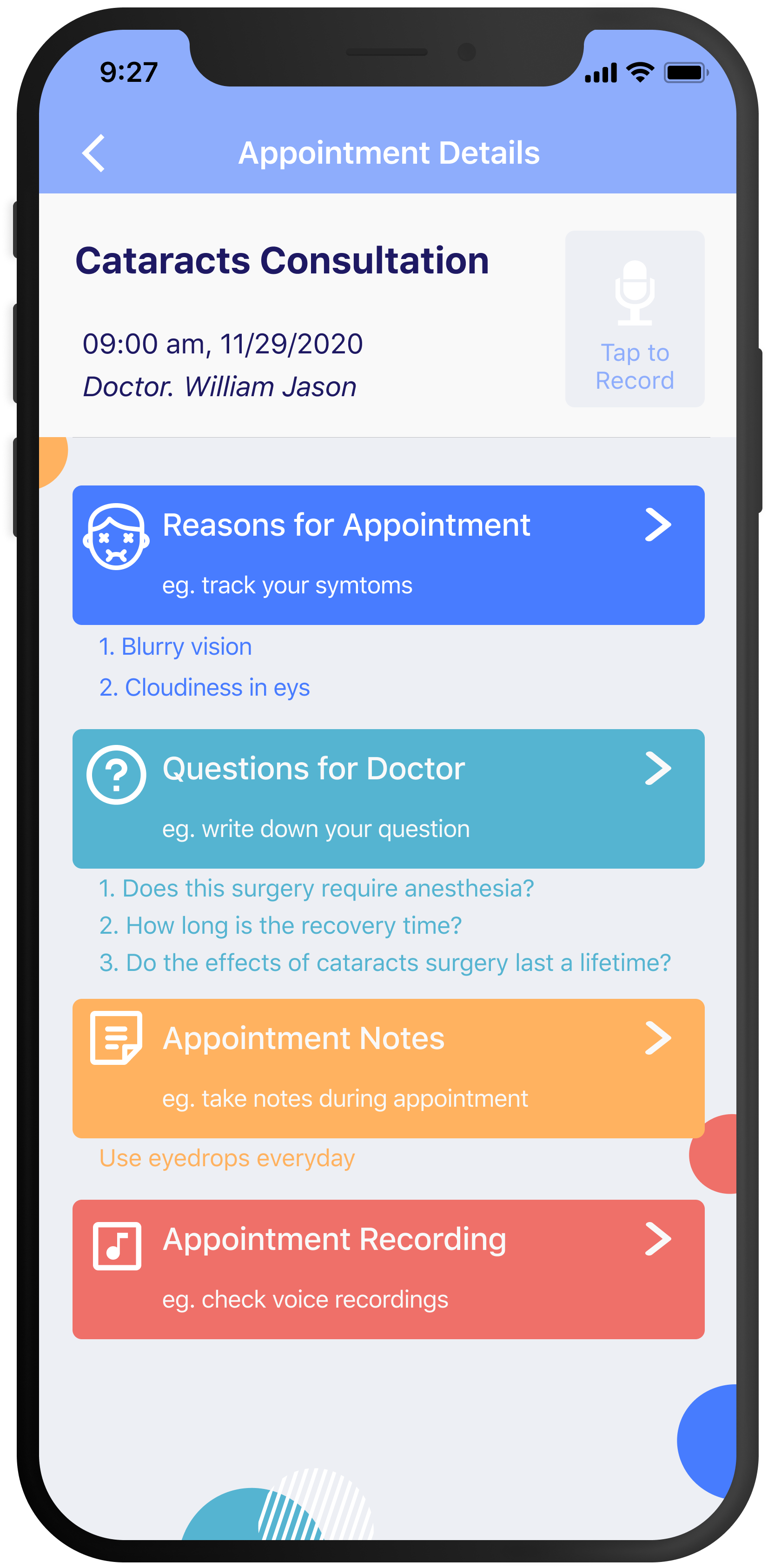
Based on the low-fi prototype and usability testing, the hi-fi prototype was created not only present the aesthetic value of the design but also reflect the details that create a better interaction experience for users.
1. Add an appointment
2. Add symptom for the appointment
3. Add question for the appointment
4. Start engaging in the appointment
5. Record and take notes during appointment
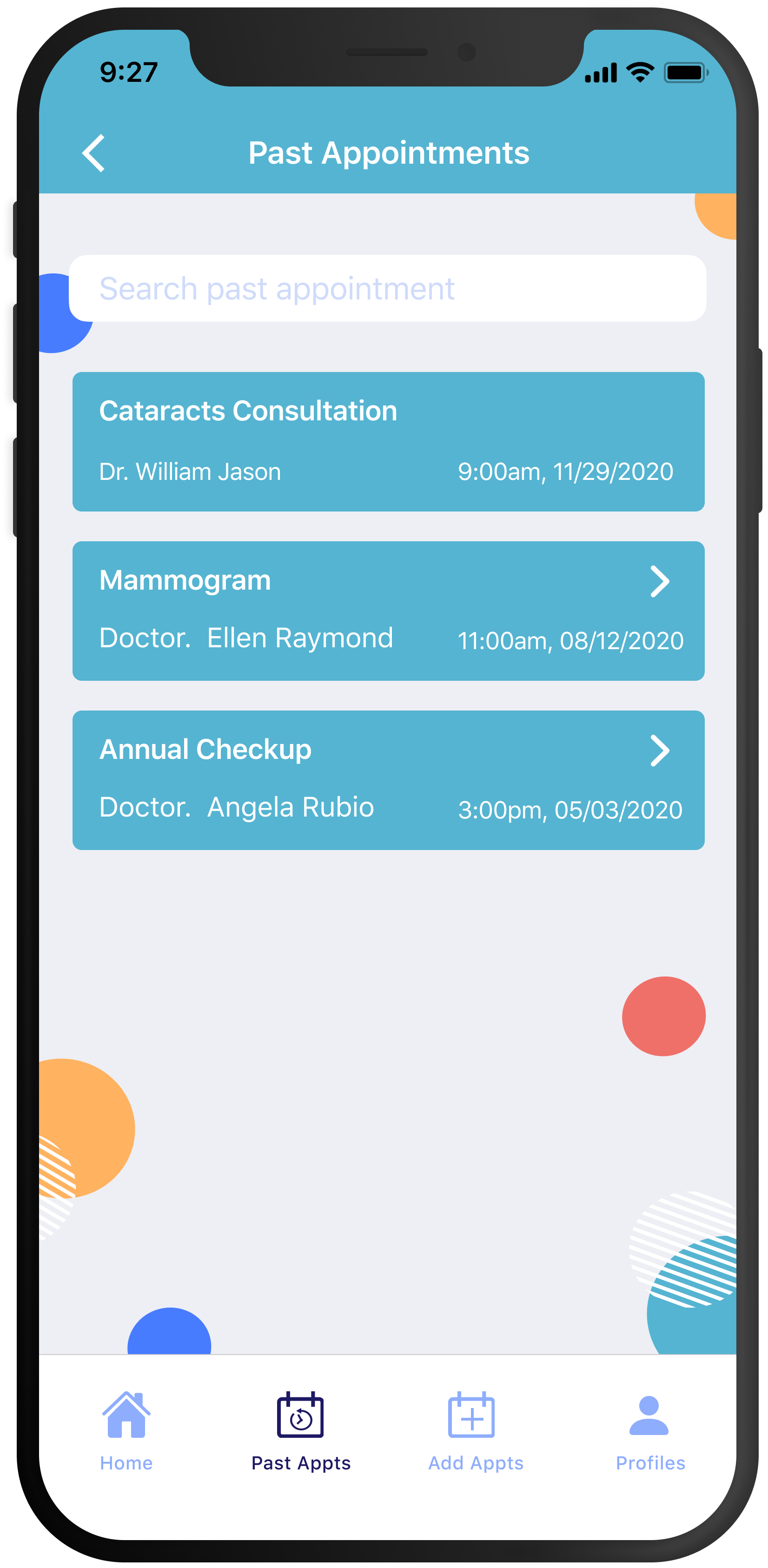
6. Check past appointment details
7. Share medicial records with others
8. Profiles and settings
evaluation
sus score
The improving System usability scale (SUS) scores demonstrated that the design iterations are more and more intuitive, efficient, and able to meet users’ needs. Besides, I also collected some data by conducting more user testing sessions, which would help refine the design and flow in the future.
SUS Score
LO-FI PROTYPE
90.215
HI-FI PROTYPE
98.435
Afterthoughts
Future Direction
Explore the possibility of linking the app to existing medical portals
This would allow medical records and appointment information to automatically sync with the app.
Research a more diverse user base
The majority of the research participants were Caucasian females with at least a bachelor's degree. I’d like to see how our findings might differ with a different user base.
Dive deeper into the caregiver experience
To better understand caregiver needs. The research focused on the patient, but I know that caregivers play an important role in many patients’ medical experiences. I’d like to understand how can better enable caregivers to support patients via our design.
Continue to simplify the user experience
By conducting additional user research and usability tests. This is especially important given that our user base is older and generally less tech-savvy.
Handwriting
Some users I talked to believed they would never be willing to give up handwritten notes completely, even though they found the app useful. A future design could explore a feature
Reflection
I chose a problem space that matters to each of us. Empowering older patients during the medical process is something that is meaningful to everyone in society and very personal for some of us. This made me care more deeply about the design solution.
I achieved the intended purpose of the design requirement in that I believe to get a better understanding of the design process.
In the end, I designed something our grandmas are proud of!


