Retire Investment APP Design
engaged flow
Develop an engaging and intuitive user interaction
outcome visualized
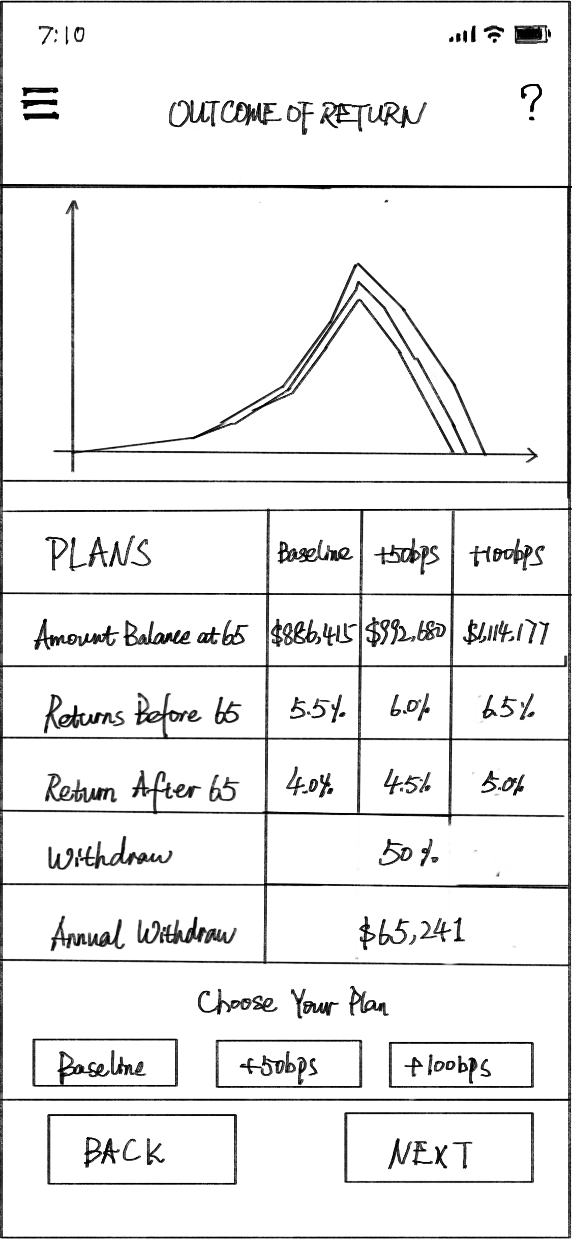
Visualize outcomes from different changes in BPS
Clear& attractive
Provide both statistics and graphics to users
goal
Develop an engaging and intuitive interaction, clear and attractive for users to choose retire investment plans.
duration
20 Days (June, 2020 - July, 2020)
Tools
Drafting Tools, Adobe Illustrator, Adobe Photoshop. Adobe XD, Sketch, Figma, iPad Sketchbook
introduction
ABC Capital provides retire investment plans and seeks a design for a mobile app interaction that clients can use to visulize the dramatic outcomes that can result from slight changes in BPS (Basis Points). This is a sales, the critical information should be conveyed immediately and attractively, and the design should be easy to use.
Research
Background
How much income people save for retirement plan
NUMBERS
36%
36% of people don’t save any for retirement plan
20%
20% of people save only 5 percent or less of what they make for retirement plan .
28%
28% of people save only 6-10 percent of what they make for retirement plan
10%
10% of people save only 10-15 percent of what they make for retirement plan
16%
16% of people save more than 15 percent of what they make for retirement plan .
How much do you currently have saved for retirement?
SITUATION
There’s huge market potential for retire investment.
Most people need more investment plans for their retirement save
Professional and understandable investment guidance are required by the market
Interview
There were brief interview with 10 people and 32 surveys I had conducted from different industries. Questions include job tile, current retire investment and future plan, etc.
“I stay my retirement plan with my employer, and chose the default plan. But I’d like to invest more separately if I can select and understand different plans “ _Software Engineer
“I don’t have plan to do extra retire investment since I have a good long-time plan. Stock market is more attractive for me currently, but I don’t mind tracking the new plans if there’s really great opportunity.” _Financial Advisor
“No retire investment yet, but I feel it’s time to make some contribution for my future life. I prefer clear invest and return relationship when I choose the plan.” _Waitress
“Currently I have several retire plans ongoing, sometimes I got lost with those numbers and plan details. I want to transfer my investment to a platform that understandable and operatable for me who don’t have financial background.” _Self-Employed
survey
Respondents' occupations
Attitude to investment plan
Personas
Based on the collected result from respondents, I find there are 4 types of basic personas.
PERSONA - A
Actively looking for the investment. He/she needs clear present of invest and return relationship.
PERSONA - B
Potentially looking for the investment. He/she values the visualization among the outcome difference base on plan selection.
PERSONA - C
Potentially looking for the investment. He/she prefer the engaging and intuitive user interaction and interface.
PERSONA - D
Actively looking for the investment. He/she requires process and date are easy to understand,
analysis
Conclusions
According to the research result, it brought the followings that the design should focus on
Identify the core of the problem and interpret the source data
Articulate the UX process
Accurately represent the source data
Develop an engaging and intuitive user interaction
Visualize outcomes from different changes in BPS
Clear and attractive for clients
ideation
workflow
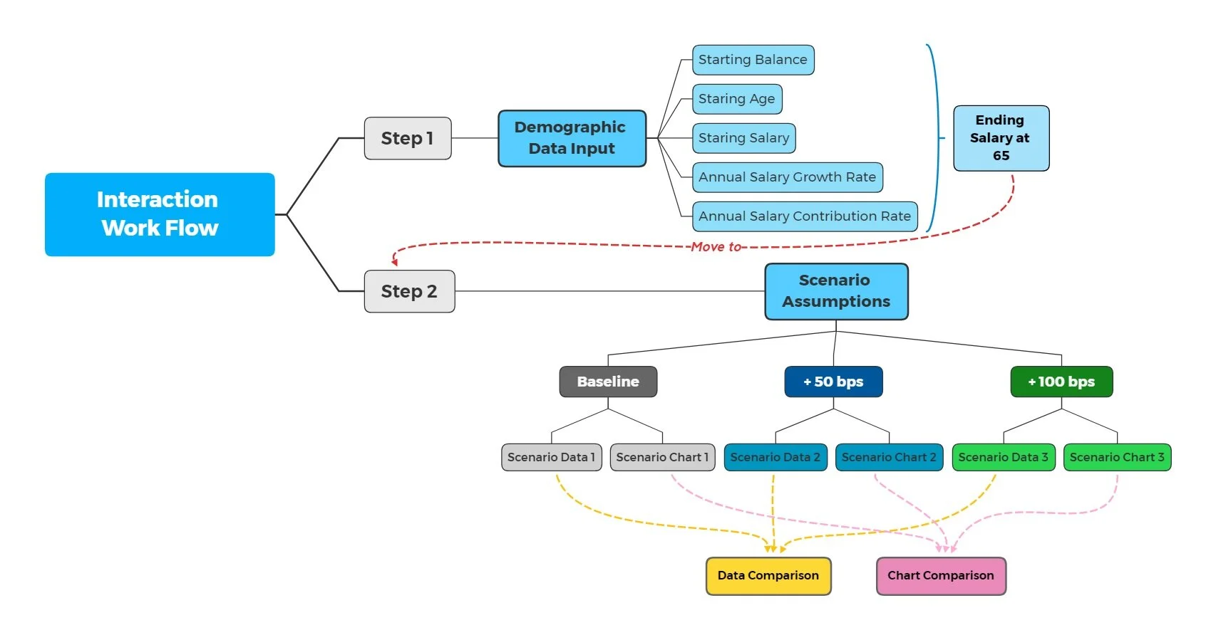
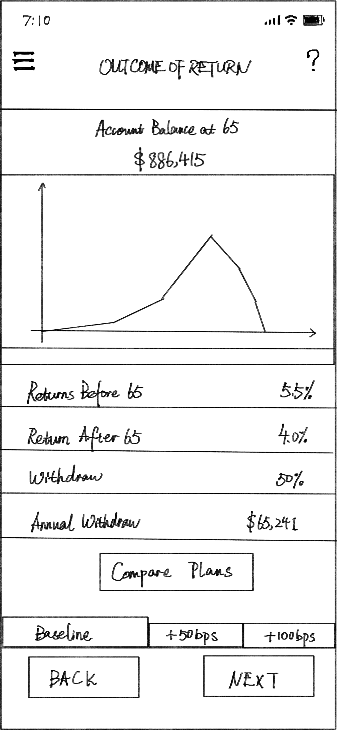
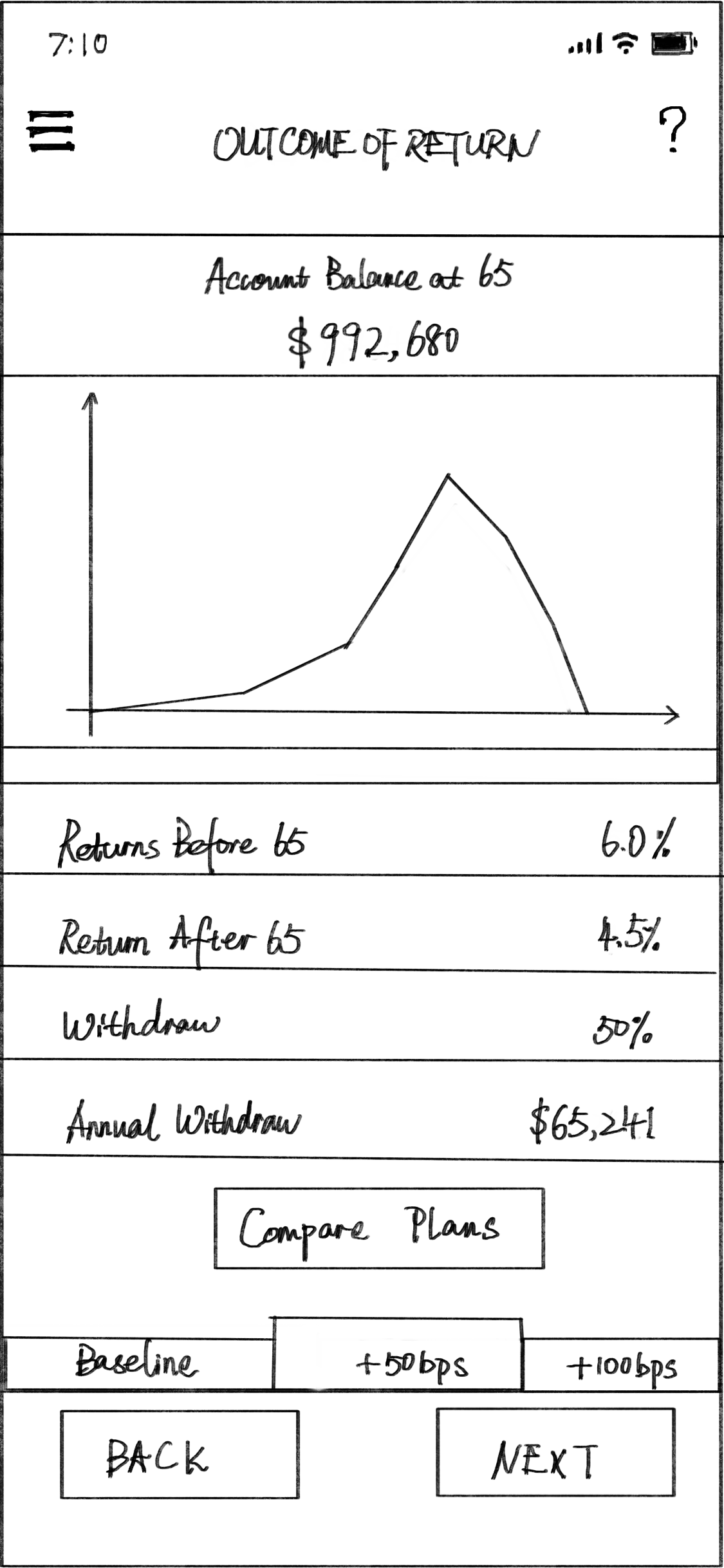
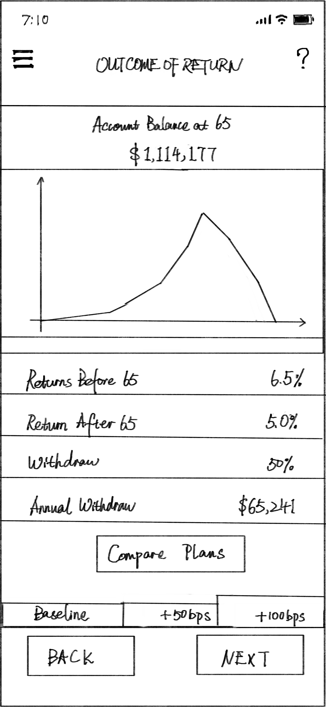
Based on the workflow, there are two steps. The “Step 1“ is the basic information input, such as age, salary, and balance. The “Step 2” is the plan choose (Baseline, +50bps, +100bps), according to the entered information. In addition, users are able to do comparison among different plans by data and chart.
Feature diagrams
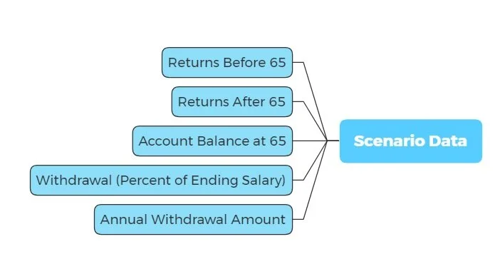
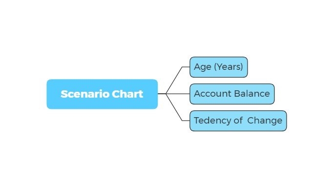
In each plan, there are data and chart options present the details.
prototype
Wireframe
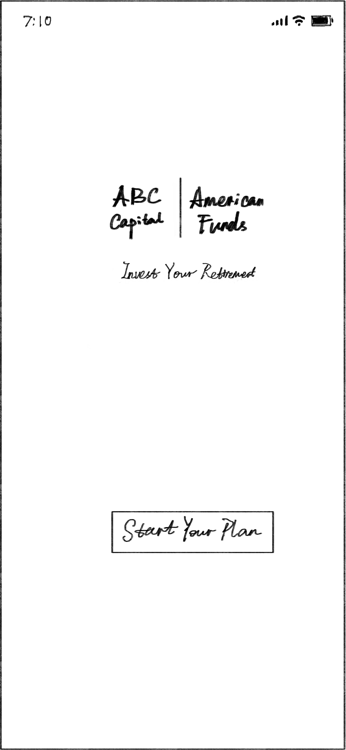
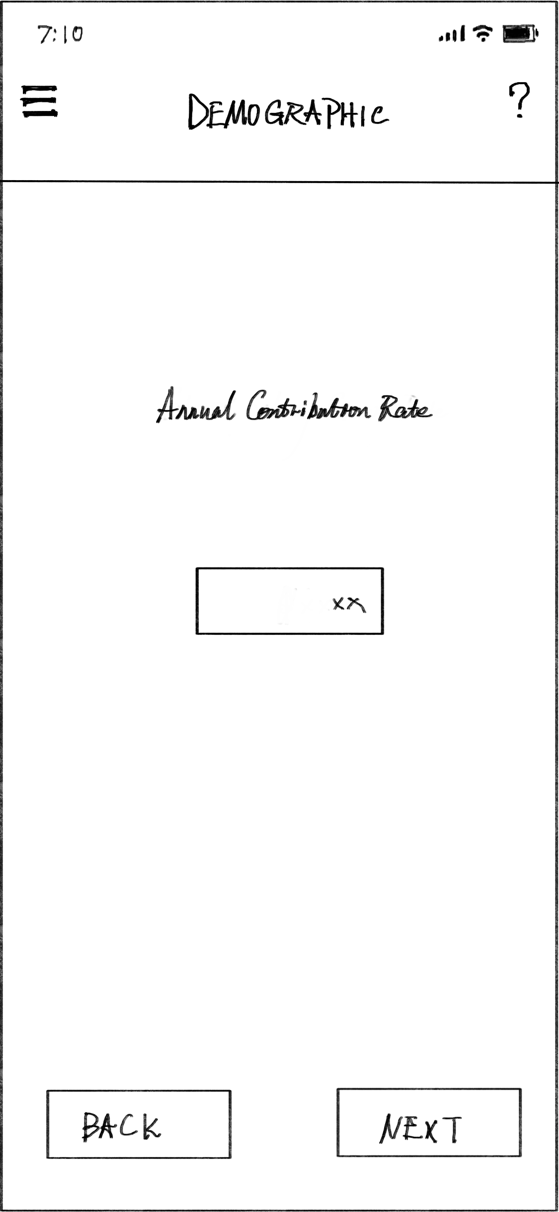
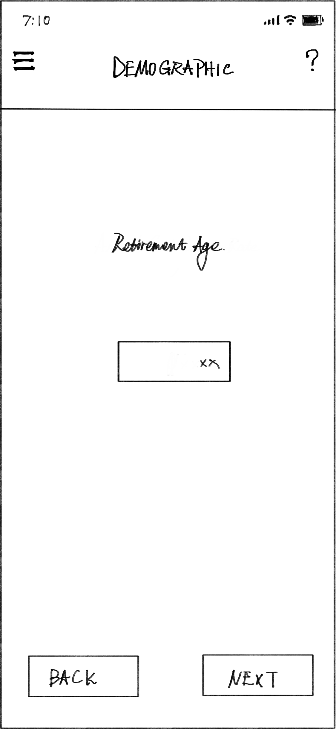
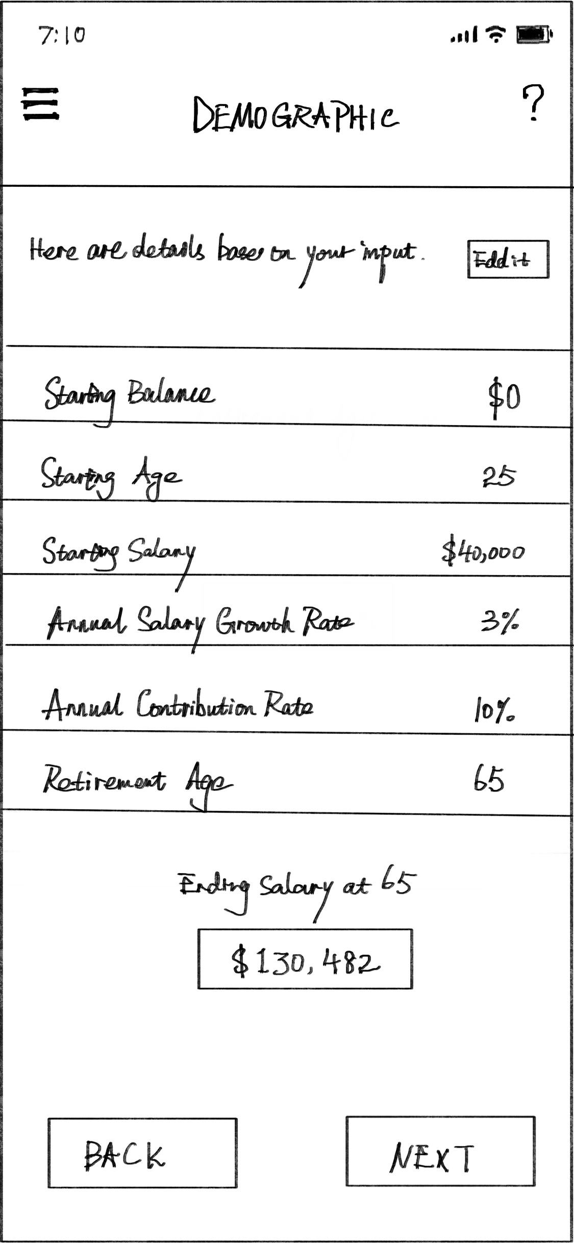
These based on functions, features and workflow were discussed before, then combined together as organized interfaces.
user flows
interaction
high fidelity interfaces
Based on the ideation and sketch, these interfaces not only present the aesthetic value of the design, but also reflect the details that creating the better interaction experience for users.
Welcome Page
Clearly present logos and App name.
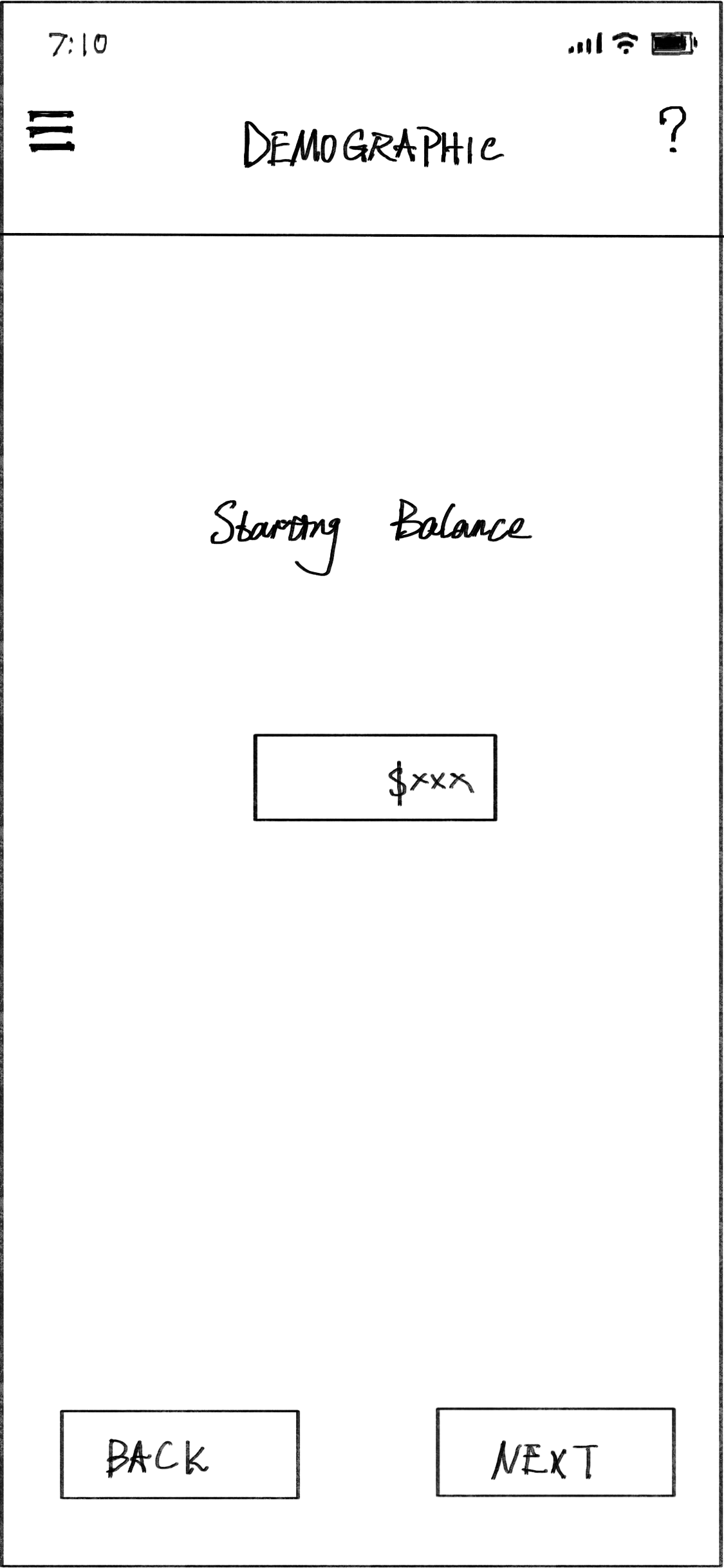
Demographic Input
Starting balance.
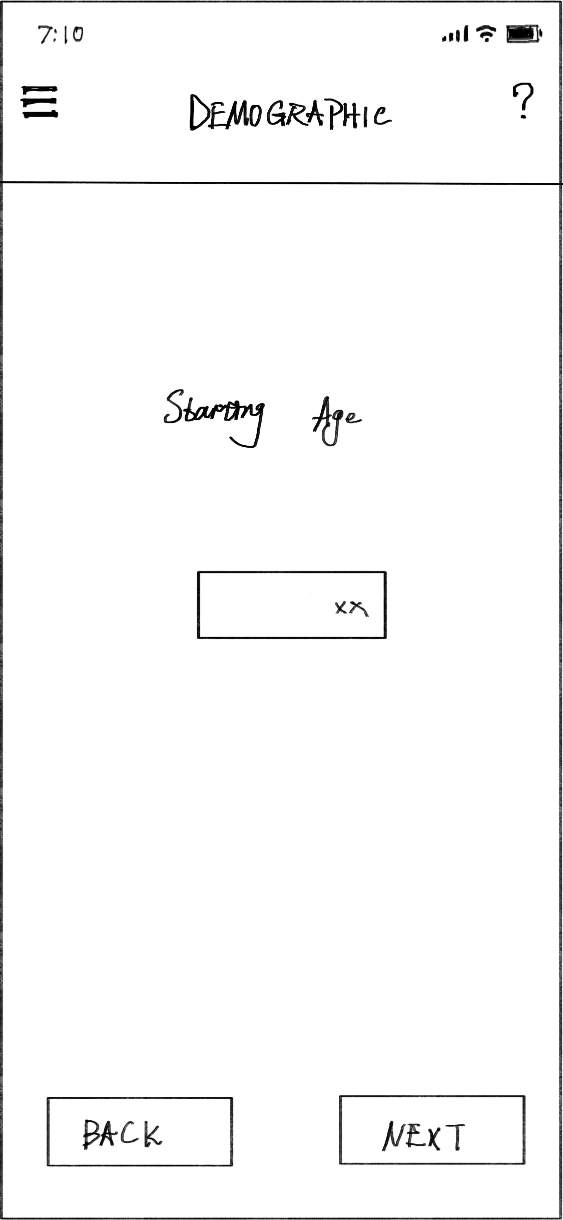
Demographic Input
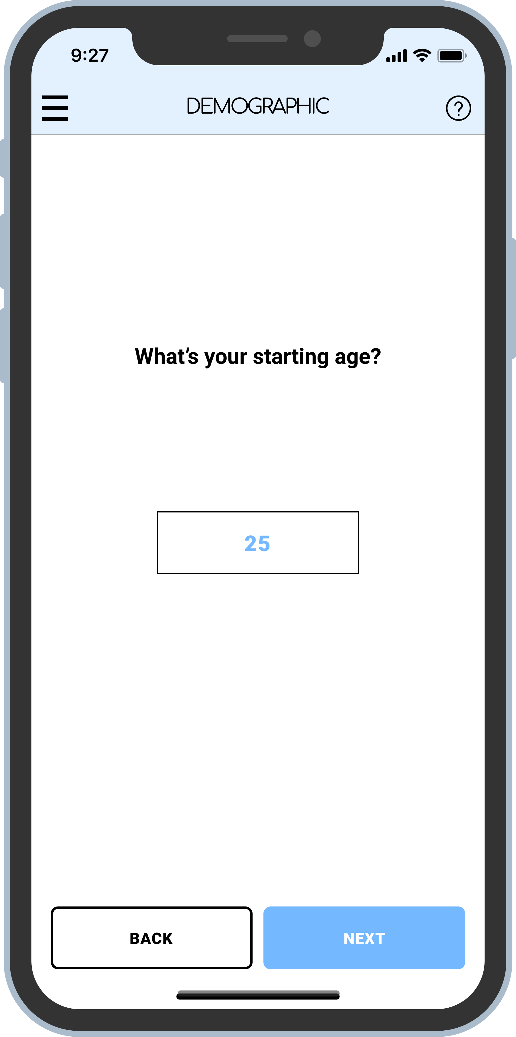
Starting age.
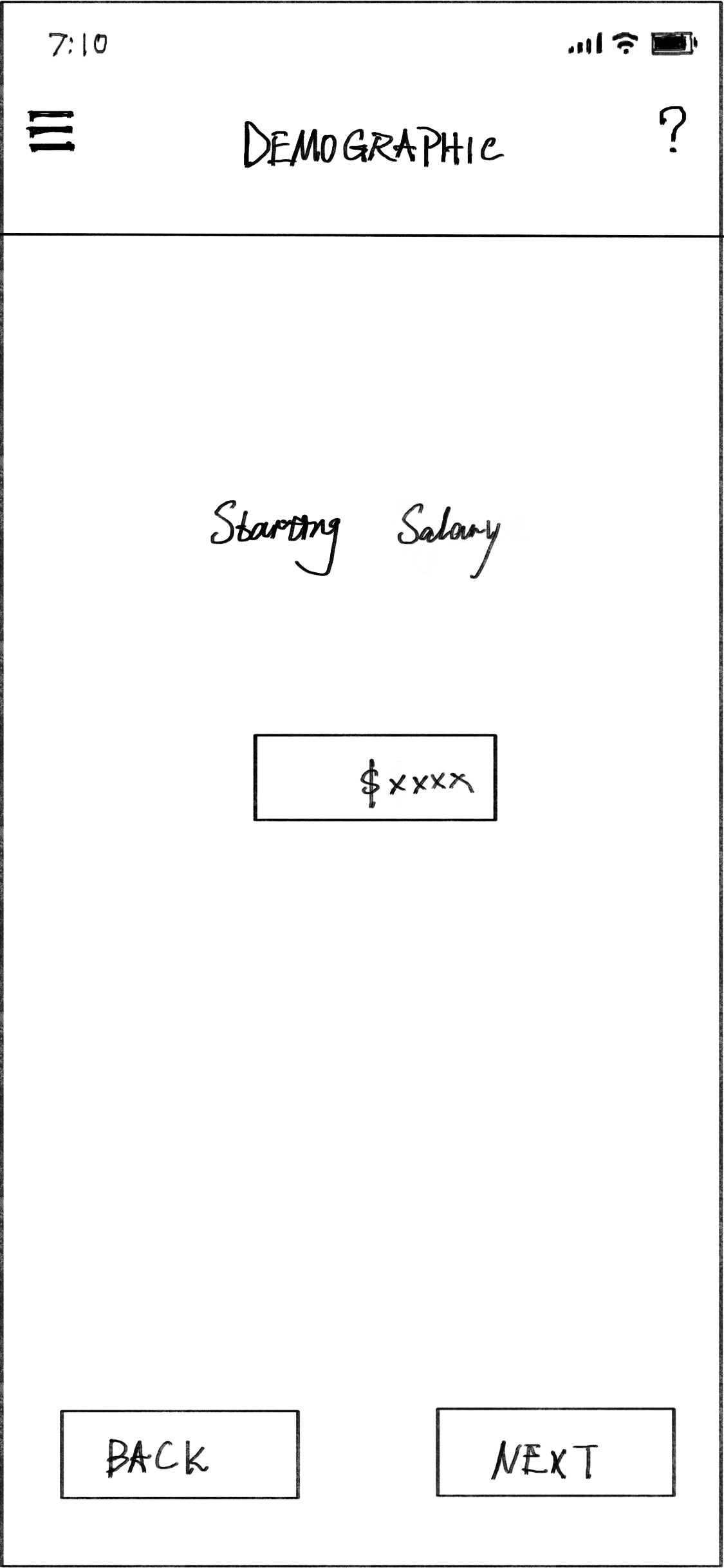
Demographic Input
Starting salary
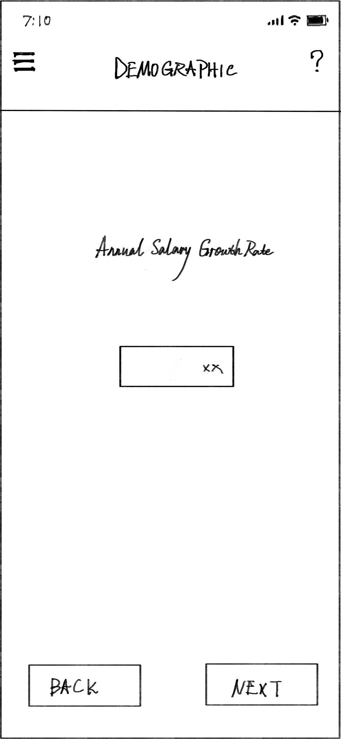
Demographic Input
Annual salary growth rate.
Demographic Input
Annual contribution rate.
Demographic Input
Retirement age.
Demographic Input Summary
Summary based one input data.
Plan Choices
Three availble plans for choose.
Plan Comparison
Data and chart details.
Plan Details
“Baseline“ plan.
Completed Page
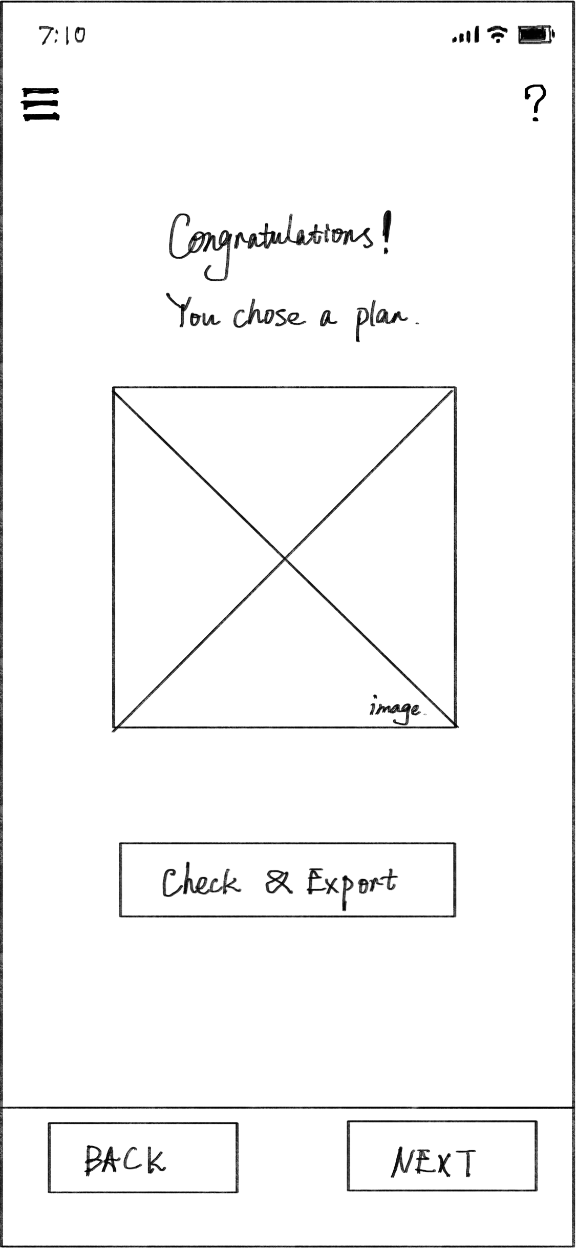
After choosing the plan, then export it.
Plan Details
“+50 bps“ plan.
Plan Details
“+100 bps“ plan.
evaluation
user testing
I conducted 3 heuristic evaluation sessions and 3 usability testing sessions for each interactions. The improving System usability scale (SUS) scores demonstrated that our design iterations are more and more intuitive, efficient, and able to meet users’ needs. Besides, I also collected some data by conducting more user testing sessions, which would help refine the design and flow in the future.
SUS Score
WIREFRAME
90.135
HI-FI ITERATION
96.215
Afterthoughts
Consider all stakeholders
Design always involves input from all different perspectives. To be a better UX designer, our job is not just bring skills and approaches that balance complex requirements from users, yet design and improve the solution to meet these needs. It’s extremely critical experience that users are able to choose and clearly understand contents what they see and browse.
future development
User testing and feedback to refine the design and flow
Design evaluation to improve the user experience
More survey and interviews for users and marketing


